

Client
STB
Sector
Packaging
Exploration
Chit Chat
Brand Identity and Packaging Design

In an age of increasing loneliness among the elderly, Chit Chat offers more than just bird seed; it fosters connection, companionship, and purpose. Bird feeding has long been a simple yet meaningful pastime, providing solace and routine, particularly for those who have lost friends to old age and find themselves in loneliness. Chit Chat looks to turn birding it into a social movement by encouraging conversations between birders and creating opportunities for intergenerational friendships and engagement.
Through community-driven initiatives, social campaigns, and outreach programs, the brand seeks to combat isolation and strengthen social bonds. By making bird feeding a shared experience, Chit Chat brings people together.
The brand aims to be active socially with campaigns to find a way to create a better social economy for the elderly and for birders as a whole.

The Chit Chat logo is crafted to reflect the brand’s emphasis on connection, warmth, and nostalgia. The hand-drawn script evokes a sense of familiarity and personal touch, reinforcing the idea of conversation and companionship. Flowing, organic letterforms suggest ease and informality, mirroring the natural rhythm of both bird chatter and human conversation.
A single continuous line extends from the typography, forming the silhouette of a small bird in flight, visually linking the act of feeding birds to moments of shared interaction. This subtle integration transforms the logo into more than just a wordmark—it becomes a symbol of social engagement and gentle movement, reinforcing the brand’s mission.
The soft, muted colour palette enhances the design’s timeless quality, grounding it in a sense of heritage while maintaining a modern edge. The result is a logo that feels personal, inviting, and purpose-driven, capturing the heart of Chit Chat’s social impact.

The Chit Chat packaging transforms bird seed into a medium for lighthearted connection, reinforcing the brand’s mission to combat loneliness through shared experiences. Each bag features hand-drawn illustrations of birds engaged in playful dialogue, using puns and humour to encourage conversation and interaction between buyers. This storytelling approach makes the packaging more than just functional—it invites engagement, turning a routine purchase into a moment of joy and connection.
A soft, earth-toned colour palette ensures a warm, approachable aesthetic while maintaining a natural, organic feel. The layout balances illustration with clean typography, ensuring clarity while retaining a handcrafted charm. The matte finish and resealable design enhance practicality, making storage convenient for users of all ages. By merging visual appeal, humor, and function, the packaging reflects Chit Chat’s broader mission—creating opportunities for social interaction, one bird feeder at a time.
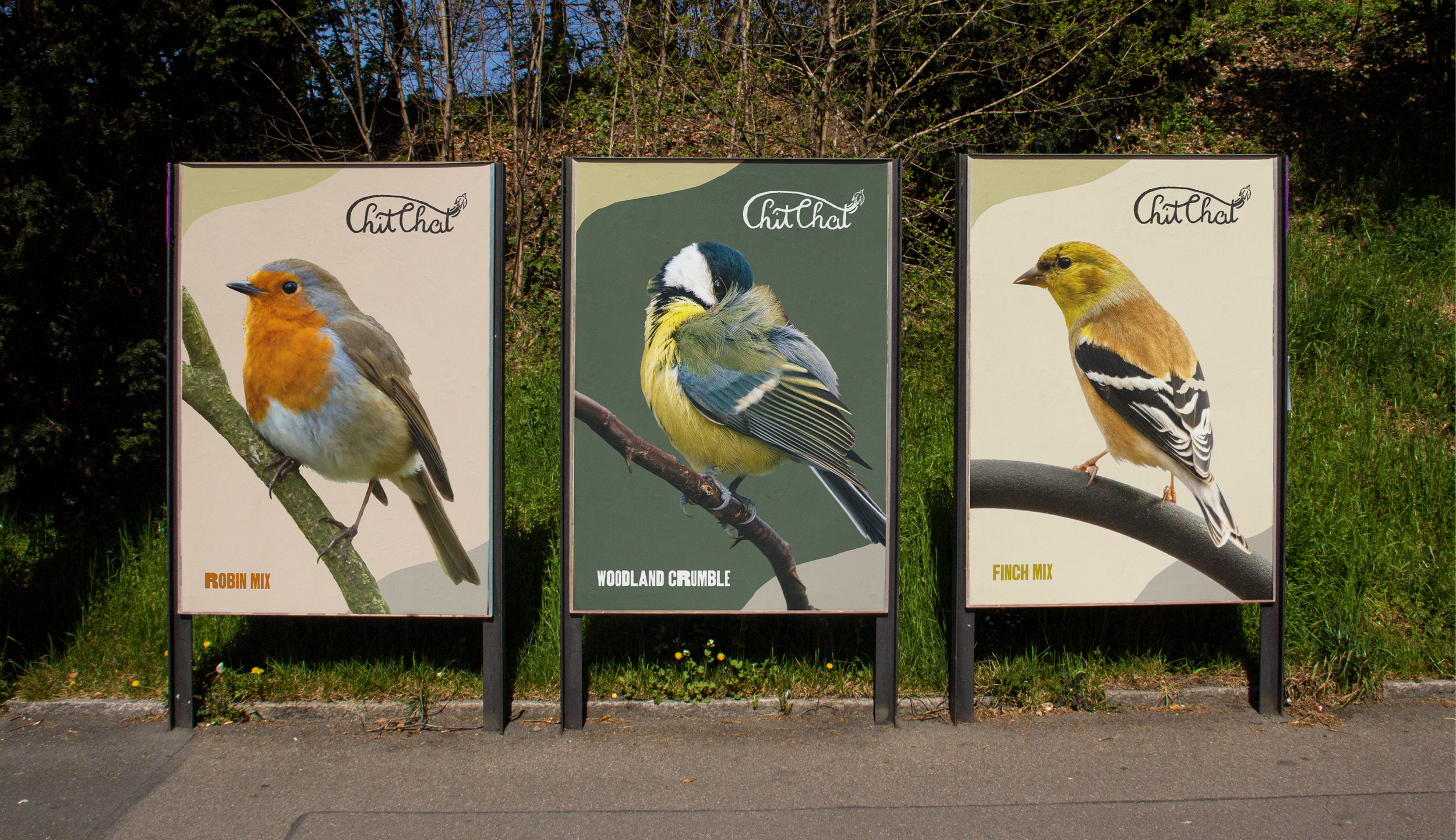
The Chit Chat advertising strategy embraces a minimal yet striking approach, using high-quality bird photography to create instant visual recognition. Each poster is dedicated to a specific bird species, reinforcing product differentiation while maintaining a cohesive brand presence. The absence of cluttered messaging allows the imagery to speak for itself, evoking a sense of calm and appreciation for nature.
By placing these ads in outdoor environments, the campaign connects directly with its audience in spaces where bird feeding is most relevant. The natural colour palette, featuring soft greens, earthy browns, and muted yellows, ensures the posters blend seamlessly into rural and suburban settings while remaining eye-catching in urban locations. The Chit Chat logo, placed subtly at the top, reinforces brand identity without overpowering the imagery.
This campaign positions Chit Chat as more than a bird seed brand—it’s a gateway to shared moments, sparking conversations and fostering a sense of connection through the simple act of feeding birds.

The Chit Chat project builds a brand that extends beyond bird seed, creating a social movement centred around connection. The interactive social media campaign encourages engagement, inviting users to share their bird-feeding moments and fostering an online community. By transforming a solitary hobby into a shared experience, the brand strengthens its commitment to reducing loneliness, particularly among the elderly.
Every design decision, from the hand-drawn logo and warm packaging to the striking, nature-focused advertising, works together to reinforce the brand’s mission of bringing people together through nature. The campaign’s balance of traditional and digital strategies ensures that Chit Chat remains relevant across generations, making bird feeding more than a pastime. It becomes a catalyst for conversation, companionship, and community-building. Ultimately, Chit Chat stands as an innovative example of how branding can bridge the gap between product and purpose, enriching lives through simple, everyday interactions.