
Client
Self-Initiated
Sector
Brand Identity
UX/UI
Intake
UX/UI and Brand Identity Design

Fitness with Intake
Intake is a personal nutrition app, with the aim of making calorie-counting and nutrient tracking for health and weight-control easier with the help of AI. Intake aims to take the form of a personal nutrition assistant to help you better plan your meals with pragmatism and personal adaptation.
The app is designed to spot the faults and bad habits of the user and counteract them with subtle diet adjustments to ease them into a healthier way of life. As society makes a shift toward health conscious living, Intake looks to create a new perspective towards food awareness so that users can make informed eating decisions without a one-size-fits-all approach.
The challenge was to create a nutrition app that simplifies calorie and nutrient tracking in a way that would remove the need for such heavy pressure on the user to get things right. Adaptation to the user's needs and existing habits allow the app to guide the user to make more informed decisions as they navigate the day, without being required to be nutritionists themselves.
This removes the need for rigid, non-bespoke plans found online, and thus creating a margin for impulsive errors. Such errors as not logging a meal one day, and letting it spiral can really slow down progress. The app is also made to consider cheat-days and treats to keep things balanced, helping the user to stay on track in a way that's comfortable for them.
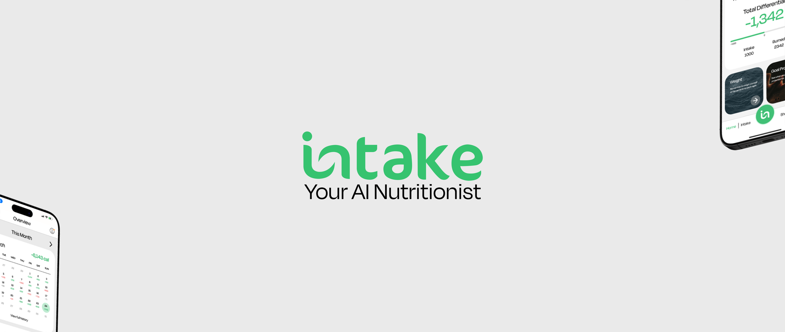
The Intake logo is designed to reflect the app’s core mission; making nutrition tracking effortless, adaptive, and personal. The custom lowercase typography conveys a friendly and accessible tone, reinforcing the idea of an approachable AI assistant rather than a rigid diet tool. The green colour palette is synonymous with health, balance, and fresh food, aligning with the app’s focus on nutrition and well-being.
A subtle modification in the “in” letterform creates a distinctive, fluid mark that hints at both a bite shape and a continuous loop, symbolising adaptability and seamless meal tracking. The tagline, “Your AI Nutritionist,” reinforces the app’s intelligent, personalised guidance.
The design ensures clarity across digital platforms, avoiding unnecessary complexity while remaining instantly recognisable. This modern identity system positions Intake as an innovative, AI-driven solution that fits naturally into daily life, bridging the gap between structured diet plans and real-world eating habits.

The Intake UI prioritises clarity, adaptability, and seamless navigation, ensuring users can track their nutrition effortlessly. A minimalist design language dominated by a neutral background, soft shadows, and accent greens. Keeps the interface clean, reinforcing the app’s focus on balance and well-being.
The dashboard-driven layout presents key statistics upfront, such as total intake, burned calories, and net differentials, reducing cognitive load while offering instant insights. A calendar view introduces long-term tracking, allowing users to monitor trends over time. Each meal entry is structured into intuitive modular cards, enabling fast food logging and AI-powered suggestions to refine choices.
A bottom navigation bar ensures easy access to primary functions, with a prominent floating action button for quick interaction. The logo’s integration within UI elements strengthens brand consistency, while adaptive typography and spacing enhance readability across devices. This streamlined, AI-assisted experience transforms nutrition tracking into a practical and engaging habit.

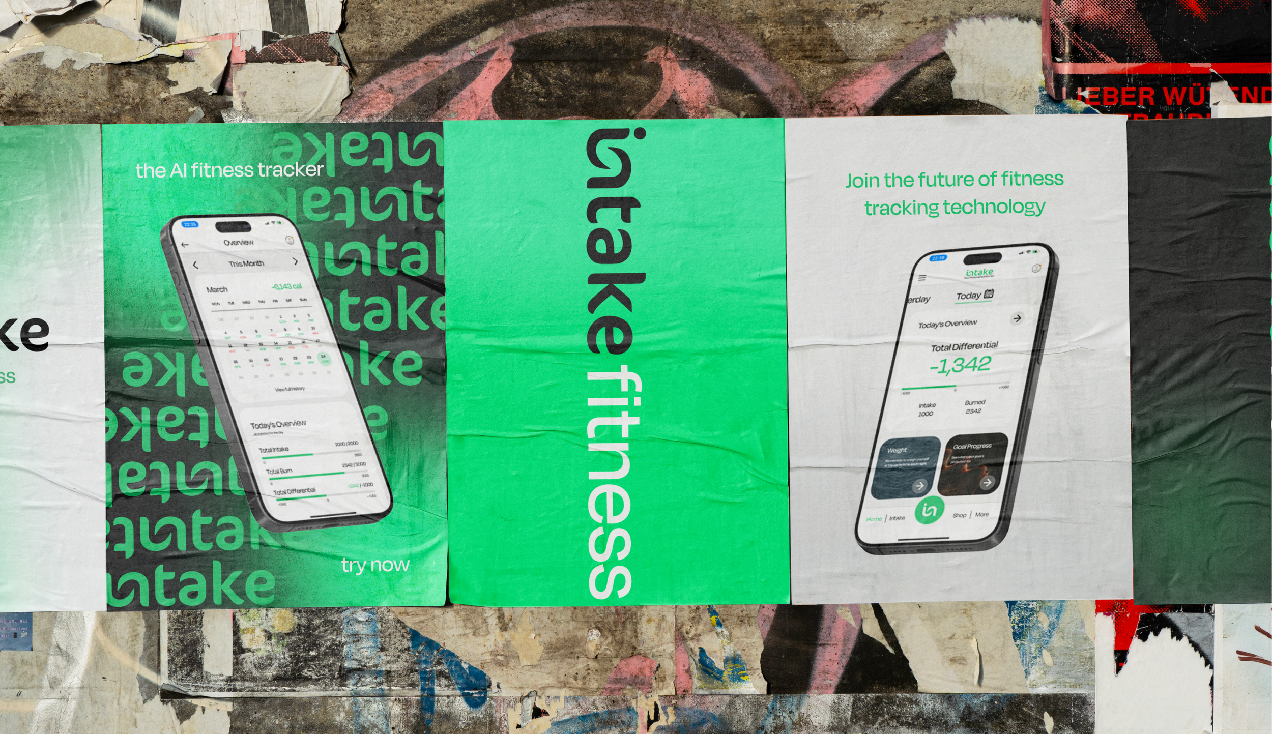
The Intake advertising strategy leverages a bold, urban aesthetic, ensuring high visibility and immediate brand recognition. The posters utilise layered compositions, creating a sense of movement and dynamism that aligns with the app’s adaptive, AI-driven functionality. A repetitive typographic pattern reinforces brand recall, while the contrasting green and black colour scheme commands attention in busy urban environments.
By incorporating high-quality renders of the app interface, the campaign highlights core features at a glance, emphasising usability and real-time data tracking. The vertical logotype placement introduces a modern, unconventional layout that disrupts standard poster formats, mirroring the app’s innovative approach to nutrition tracking.
Strategically placed in high-footfall areas, this guerrilla-style advertising engages passersby organically, blending into the visual language of contemporary street culture. The messaging “Join the future of fitness tracking technology” positions Intake as a next-generation solution, appealing to a tech-savvy audience seeking intuitive health management tools.

Intake offers a smarter, more intuitive way to track nutrition, using AI to simplify meal planning and calorie management. The project establishes a clear, user-driven identity, positioning the app as a practical tool for real-world eating habits. A streamlined interface presents key data with clarity, ensuring effortless tracking without overwhelming the user.
The branding reinforces this simplicity, with a clean, modern aesthetic that aligns with the app’s purpose. The advertising campaign strengthens recognition through bold visuals and urban placements, creating a strong presence in high-traffic areas. Every element, from the logo to the UI, works cohesively to make nutrition tracking engaging, efficient, and accessible. Intake isn’t just about logging food; it’s a tool designed to support sustainable, informed choices for better long-term health.