
Re:Juice
Brand Identity and Packaging Design
Client
BrandOpus
Sector
Packaging
Sustainability
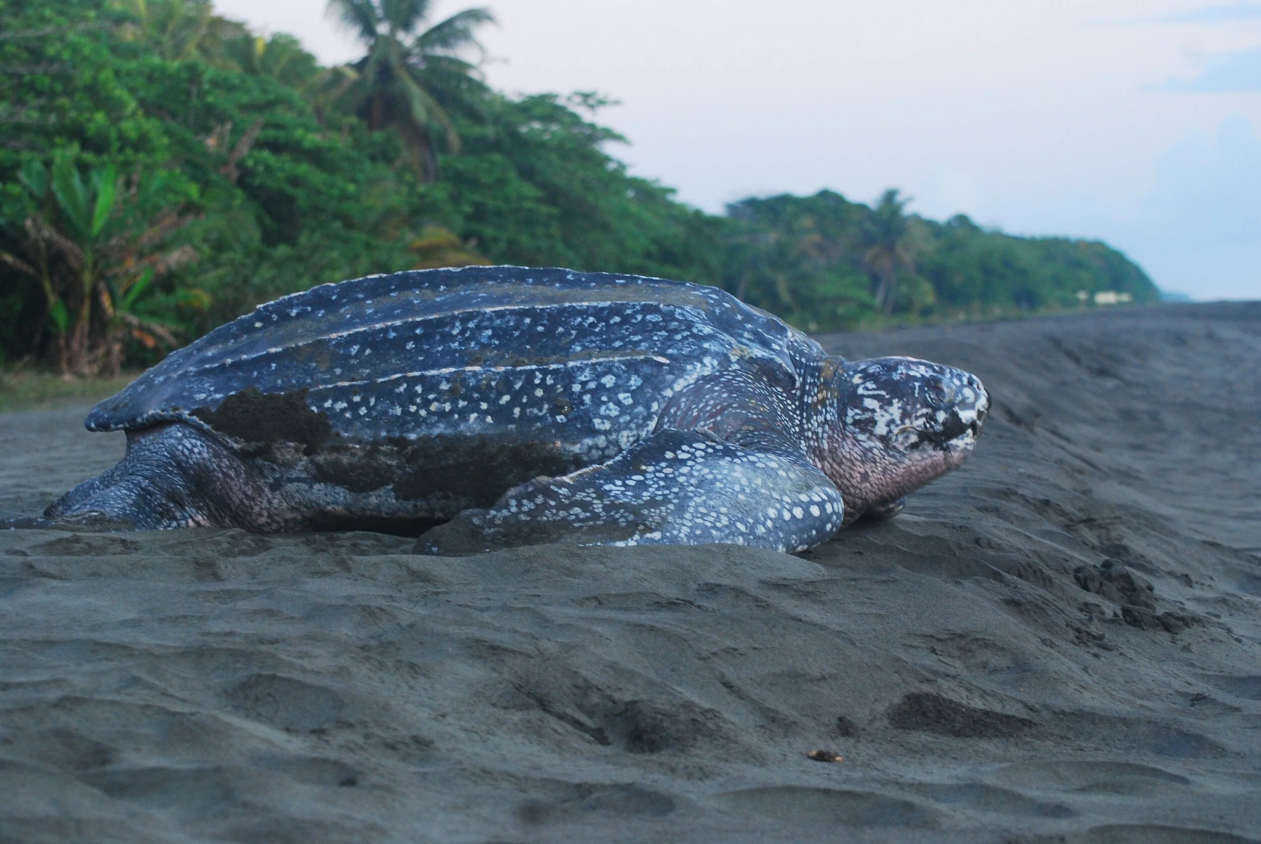
The Endangered Leatherback Sea Turtle
Re:Juice is a sustainable cocktail brand redefining drinking culture and bringing conscious consumption to mixology. In a world where marine ecosystems are under threat, Re:Juice is committed to reducing ocean waste from consumer beverage packaging. Re:Juice emerges as both a product and a movement–delivering fun and delicious cocktails that have a connection to social responsibility.
By using eco-friendly materials and supporting ocean conservation, the brand seeks to counteract the damage caused by single-use plastics. Each cocktail sold contributes to marine protection efforts, ensuring that future generations can enjoy both clean oceans and the wildlife they sustain.
Re:Juice was created to challenge the environmental impact of the cocktail, where single-use disposable packaging and consumer waste contribute to ocean pollution. The goal is to develop a sustainable drinks brand that not only offers high-quality cocktails but actively reduces harm to marine ecosystems. The challenge lies in balancing sustainability with practicality–designing eco-friendly packaging that preserves freshness while remaining functional and desirable to consumers.
Additionally, the brand must communicate its environmental mission effectively, ensuring that every cocktail sold drives real impact. The solution must seamlessly merge mixology, sustainability, and conservation, making responsible drinking both effortless and aspirational.

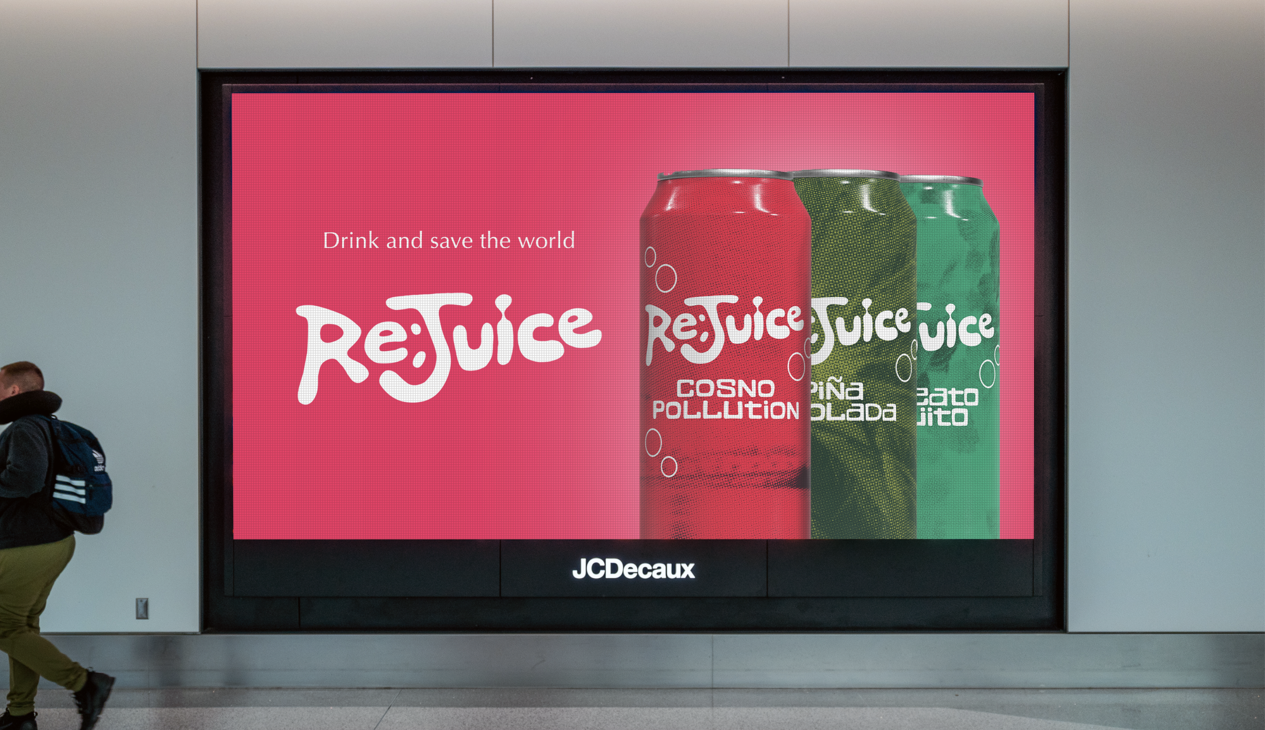
Inspired by the organic movement of liquids and the free-flowing forms of the ocean, the letterforms are soft, rounded, and dynamic, mirroring the gentle undulations of waves and the effervescence of a freshly poured cocktail.
The natural forms use an unconventional letter structure reflecting the brand’s approach to breaking from rigid, corporate aesthetics to embrace a more fluid, contemporary identity. Paired with a vibrant colour palette, the logo is designed to stand out, while communicating an effortless sense of refreshment and conveying the brands connection to the natural world.

The packaging design is a functional and symbolic extension of the brand’s sustainability mission. The cans are made from aluminium, chosen for its infinite recyclability and lightweight nature, reducing transport emissions. This helps every aspect of the packaging align with the goal of minimising environmental impact while maintaining the premium quality of the cocktails.
Each flavour name integrates wordplay that connects classic cocktails to environmental themes, making the brand’s mission of sustainability impossible to ignore, and keeping it a core part of the drinking experience.


Beyond aesthetics, the project tackles the practical challenges of sustainable packaging, prioritizing recyclability without compromising the premium nature of the product. Every element, from typography to texture, is considered to create a brand that feels both aspirational and responsible.
The branding balances playfulness with purpose, engaging consumers through clever cocktail names and marine-inspired aesthetics while reinforcing an urgent environmental message.